Your website is live, the contact form works when you test it, and the inquiries are still not arriving. That is one of the most common problems I get asked about, and a website contact form almost never fails for a mysterious reason. It fails for a short list of ordinary ones, and you can check every one of them yourself in about twenty minutes.
Here is the order I work through them on an audit, with the real form from this site as the worked example.
Key Takeaways
- One field in four has no name: 24.93% of form inputs measured on mobile have no accessible name at all, so a screen reader announces nothing useful about what belongs in the box (HTTP Archive Web Almanac, 2025)
- Placeholder text is doing the work labels should: only 34.57% of those inputs get their name from a real label element, while 25.12% rely on placeholder text that vanishes the moment somebody types (HTTP Archive Web Almanac, 2025)
- Test it like a customer, not like the owner: submit your own form from a phone on mobile data, using an address you can check independently, then look in the junk folder.
A note on the numbers below. The Web Almanac figures come from a crawl of the web at large, not from a sample of Ontario local businesses, so read them as the state of the average form rather than a measurement of your competitors.
Can Anyone Actually Find Your Contact Form?
Before anything else about the form itself matters, someone has to reach it. On the audits I run, a good share of the “my form gets no leads” problem turns out to be a navigation problem, where the only route to the form is a single link in the footer that nobody scrolls to on a phone.
Work through the route a real customer takes:
- From the top of every page: a visible action in the header, on every template, not only the homepage. On this site that is the get a free audit link in the top bar on desktop, and on a phone it becomes a bar pinned to the bottom of the screen, because the top bar has no room for it.
- From the bottom of every page: repeat the action at the end of the content. Somebody who just read your whole roofing page should not have to scroll back up.
- From a phone, one handed: check the route with your thumb on an actual phone, not a narrow browser window on a desktop.
- Without a menu tap: if reaching the form requires opening a hamburger menu and choosing correctly, you have added a step that loses people.
- From search results directly: people land on service and city pages far more often than the homepage, so every one of those pages needs its own route to the form.
The mistake I see most often is a site where the contact form exists once, on a page called Contact, reachable only from a menu. That is a form the owner can find easily and a customer often cannot.
How Many Fields Should a Contact Form Have?
Ask for the minimum you need to start a conversation, and move everything else to the phone call. Every required field is another small decision, and every decision is a place where someone quietly gives up and goes back to Google.
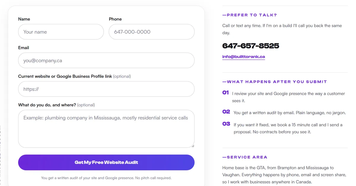
Here is the entire field set on the audit form on this site, and what each field is doing:
| Field | Input type | Required | Why it is there |
|---|---|---|---|
| Name | text |
Yes | So the reply is addressed to a person |
| Phone | tel |
Yes | A local job gets settled faster by phone than by email |
email |
Yes | Where the written audit gets sent | |
| Current website or Google Business Profile link | url |
No | Lets me start the audit before we ever speak |
| What do you do, and where? | textarea | No | Context, in the visitor’s own words |
Three required fields, two optional. That is deliberate:
- Required means required: if you will not actually use an answer, do not make it mandatory. Company size, budget range and “how did you hear about us” are the usual offenders.
- Optional fields still earn their place: the website link is optional, but most people paste one, and it turns a cold inquiry into something I can act on immediately.
- Mark the optional ones, not the required ones: GOV.UK advises adding “(optional)” to optional labels and is flat about the reverse, “never mark mandatory fields with asterisks” (GOV.UK Design System). My form labels both optional fields that way and uses no asterisks anywhere.
- Ask open questions in plain language: the last field is labelled “What do you do, and where?” rather than “Message”, because a blank box labelled Message gets blank answers.
- Give an example, not an instruction: the placeholder reads “Example: plumbing company in Mississauga, mostly residential service calls”, which shows the shape of a useful answer.
- Name the outcome on the button: the submit button says “Get My Free Website Audit”, not “Submit”. The button should describe what the person receives.
One place I differ from that guidance, and I will name it rather than hide it. GOV.UK says to “only collect phone numbers from people if you genuinely need them”, because not everyone can use a phone (GOV.UK Design System).
For a public service that is clearly right. For a local trades business where the job gets settled in a two minute call, I still make it required, and the email field is there so nobody is forced onto a channel they cannot use.
You will find a lot of confident numbers online about the “optimal” field count. I went looking for a primary source behind them and could not verify a single one, so this post does not quote any.
What I can point at is the principle the UK government design system works from: “asking just one question per question page helps users understand what you’re asking them to do, and focus on the specific question and its answer” (GOV.UK Design System). A short contact form is the same idea compressed onto one screen.
If your form asks for a budget range before it asks for a phone number, you have built a qualification screen and called it a contact form. Qualify people after they are talking to you, not before.
Do Your Form Fields Have Real Labels?
A label is the small piece of text above a field that says what belongs in it, and it needs to be a real <label> tied to that input, not grey placeholder text sitting inside the box. Placeholder text disappears the moment somebody starts typing, which means the person filling in field four can no longer see what field four was for.
Across form inputs measured on mobile, only 34.57% get their accessible name from a real label element, 25.12% get it from placeholder text alone, and 24.93% have no accessible name at all (HTTP Archive Web Almanac, 2025). Roughly half of the inputs in that mobile crawl are therefore either unlabelled or labelled by text that disappears at the worst moment. Only about a third of all the inputs measured got a real label.
The UK government design system, which is backed by published user research, rejects placeholders as labels for three specific reasons: the text vanishes when the user starts typing, which “can cause problems for users with memory conditions”, screen readers do not read it consistently, and it often fails contrast requirements (GOV.UK Design System). The standard that defines what a label is for puts it plainly: the intent, per W3C, is “to have content authors present instructions or labels that identify the controls in a form so that users know what input data is expected” (W3C, WCAG 2.2 Understanding 3.3.2).
What a properly labelled field gives you:
- The label survives typing: it stays visible while the box is being filled in, so nobody has to delete their answer to remember the question.
- Screen readers announce it: a field with no associated label is announced without a name, so the person cannot tell what to enter.
- The label becomes a tap target: tapping a correctly linked label focuses its input, which is a meaningfully bigger target on a phone than the box alone.
- Autofill has something to match: browsers use labels and field names as signals when offering saved details.
You can check this in ten seconds without reading any code. Tap the words above a field on your phone.
If the cursor jumps into the box, the label is properly connected. If nothing happens, it is decorative text.
For a second opinion, run Google Lighthouse from Chrome on your own contact page. It ships an accessibility audit whose failure title is literally “Form elements do not have associated labels”, on the stated grounds that “labels ensure that form controls are announced properly by assistive technologies, like screen readers” (Google Lighthouse source). A form that fails it is broken by Google’s own definition.
Do not read a green result as the finish line, though, and this matters for the exact problem in this section. The underlying rule accepts a name from any one of seven sources, and non-empty-placeholder is on that list alongside aria-label and non-empty-title (axe-core rule definition). A form labelled entirely by placeholder text passes the audit and still fails the customer.
Does Your Form Work Properly on a Phone?
On the local business sites I audit, most of the traffic is on a phone, so the phone is where a form is won or lost. The single highest value fix is also the least known: setting the right input type on each field changes which keyboard the phone brings up.
This is not a preference, it is documented behaviour. Mozilla’s reference states that “one of the main advantages of <input type="tel"> is that it causes mobile browsers to display a special keyboard for entering phone numbers” (MDN). Get it wrong and you are asking a customer to hunt for digits on a letter keyboard while standing in a flooded basement.
Worth knowing what it does not do. The same reference is explicit that with type="tel" “the input value is not automatically validated to a particular format before the form can be submitted, because formats for telephone numbers vary so much around the world”.
That is a feature for a local business. Let people type the number the way they normally write it, brackets, dashes and all.
The input types that matter for a local business form, plus the one to avoid:
type="tel"on the phone field: brings up the number keypad instead of the full letter keyboard.type="email"on the email field: puts the at sign and the dot on the main keyboard layout.type="url"on a website field: does the same for slashes and dots.type="text"everywhere else: the plain default is correct for names and free text, and forcing anything cleverer usually backfires.- Not
type="number"for phone numbers: GOV.UK advises against it because of “a risk of users accidentally incrementing a number”, and recommendsinputmodewhen you need a numeric keypad on a genuinely numeric field (GOV.UK Design System).
A short honest note about this site while I am naming standards. The form pictured above sets all four input types correctly and gives every field a real label, but it does not yet set autocomplete attributes, which are what let a browser offer a saved name, phone and email in one tap.
W3C treats that as its own requirement, and notes that “whether or not user agents actually autofill inputs is not relevant when evaluating this criterion” because what matters is that the field declares its purpose (W3C, WCAG 2.2 Understanding 1.3.5). That is a genuine gap on my own form, I found it while writing this post, and I would rather publish it than pretend the example is perfect.
A few more things to check on an actual phone:
- Tap targets: WCAG 2.2 sets the Level AA minimum at “at least 24 by 24 CSS pixels” for pointer targets (W3C, Success Criterion 2.5.8), and that is a floor, not a target. Build form controls a thumb can hit comfortably.
- Do not disable zoom: 19% of mobile sites still restrict pinch zoom, either by disabling scaling or capping it (HTTP Archive Web Almanac, 2025). Anyone who needs to zoom in to read your labels cannot.
- The keyboard does not cover the button: on short screens the on screen keyboard can hide the submit button entirely, which is invisible on a desktop and fatal on a phone.
Are Your Form Submissions Actually Reaching You?
This is the failure that costs the most, because everything looks fine from the outside. The visitor gets a success message, believes you have their details, and never follows up. You conclude the form does not work and stop trusting it.
There are only a few places a submission goes missing:
- The delivery address is stale: the form still points at an old inbox, or at an address that belonged to a previous web person.
- The notification is in junk: automated form mail is filtered aggressively, so check the spam folder before concluding nothing arrived.
- The form silently fails on mobile: a script error on a phone browser can break submission while the desktop version works fine.
- Nobody owns the inbox: the mail arrives at an address three people can technically access and nobody checks.
- Spam buried the real ones: if you get forty bot submissions a day, the real inquiry gets deleted along with them.
On spam specifically, the fix I reach for first is a honeypot: a hidden field a human never sees and a bot fills in automatically, so anything with that field completed can be discarded. My own form uses one, and it costs the visitor nothing.
That last part is the whole argument against reaching for a puzzle first. A W3C working group note on CAPTCHA puts it bluntly: the interactive approaches exclude many people with disabilities, “resulting in a denial of service to these users”, while “functional non-interactive approaches pose no accessibility challenge to users” (W3C, Inaccessibility of CAPTCHA). Making every real customer prove they are human, because bots exist, is a tax you charge the wrong people.
Test it the way a customer would experience it, not the way you built it:
- Submit from a phone on mobile data, not from the desktop you built the site on and not on the office wifi.
- Use an address you can check independently, so a mail rule on your own account cannot hide the result from you.
- Check the junk folder before you decide the submission vanished.
- Repeat it monthly, and after every site change, because forms break quietly during redesigns and plugin updates.
What Should Happen the Second Someone Hits Send?
Two things, and most small business forms do neither. The person needs immediate confirmation that the message actually went somewhere, and they need to know when a human will respond.
The confirmation belongs on its own page, not in a line of text where the form used to be:
- A real URL you can measure: this site redirects to a
/thankspage, which gives a countable conversion in analytics and in any ad platform, rather than a state change nothing can record. - Say what happens next: GOV.UK’s confirmation page pattern asks for “details of what happens next and when” (GOV.UK Design System). My page lists the three steps in order, so nobody is left guessing whether they are now on a sales list.
- Set the timing honestly: GOV.UK puts it as a flat instruction, “tell users when you’ll respond to them”, because it helps people choose which channel to use (GOV.UK Design System). Promise a window you will actually hit.
- Give a second route: show the phone number again, because somebody who just decided to contact you is the most likely person to also call.
The second half is the reply, and this is where inquiries die. An inquiry that arrives at 9pm on a Friday and gets answered on Monday afternoon has sat there the whole weekend, next to whoever else that person messaged the same evening.

That flow is the automation I built for World Food Equipment, a commercial refrigeration company in Mississauga, and it runs in production today. Three modules, exactly as shown above: watch the form for a submission, draft the reply, send the email. A quote request comes in and the answer goes back in the company’s voice, without anybody being at a desk.
I am naming it because it is the only automation build I can point at, and because the underlying point costs nothing to copy. You do not need an AI automation build to fix late replies. A saved reply template and a rule that inquiries get answered before the end of the day will do most of the work.
How Do You Test Your Own Contact Form?
Run this in one sitting, on a phone, as though you were a customer who has never seen the site. It takes about twenty minutes and it finds nearly everything.
- Search for your own business on a phone, click through from the result, and count the taps to reach the form from the page you actually landed on.
- Read the form cold: does every field make sense without explanation, and is anything required that you will never use?
- Tap each label and confirm the cursor moves into the field below it.
- Tap the phone field and confirm a number keypad appears, then the email field for the at sign.
- Fill it in one handed and check that the submit button is not hidden behind the keyboard.
- Submit it for real from mobile data, using an address you can check independently.
- Confirm the confirmation: you should land on a page with a URL, not just a line of text.
- Find the notification, including the junk folder, and note how long it took to arrive.
Anything that fails is a lead you have been losing, quietly, for as long as it has been broken. If you would rather have someone else run it, that is exactly what a free website audit covers.
Frequently Asked Questions
How many fields should a small business contact form have?
Ask for the minimum you need to start a conversation and no more. On my own website contact form that is three required fields, name, phone and email, plus two optional ones. Every extra required field is another reason for someone to abandon the form, and the detailed questions belong on the phone call anyway.
Why do I get form spam instead of real leads?
Most small business form spam comes from bots that submit every form they can find, not from people. A hidden honeypot field is the usual first fix, because bots fill it in and humans never see it, so the submission can be discarded without making real customers solve a puzzle. My own form uses one.
Should a contact form redirect to a thank you page?
Yes, and it is worth more than the small message that appears in place of the form. A real confirmation page gives you a URL you can count as a conversion in analytics and in ad platforms, and it gives you room to say what happens next and how long a reply will take.
Does a contact form need a phone number field?
For a local business, usually yes, because a phone call closes work faster than an email thread does. Mark it required only if you will actually use it. If you ask for a phone number, set the field type to tel so that phones bring up the number keypad instead of the letter keyboard.
How do I know if my contact form emails are being delivered?
Submit the form yourself from a phone on mobile data, not from the computer you built the site on, and use an address you can check independently. Then look in the junk folder. A form that reports success on screen can still be failing to deliver, and nothing on the page will tell you.
Is a contact form better than just listing a phone number?
Neither one replaces the other, so publish both. A phone number wins the customer who is ready now, and a form catches the person browsing at 11pm who will not ring a stranger. Make the number a tap to call link so a phone dials it in one touch.
Wrapping Up
A contact form is the narrowest point on your whole website. Everything else you spend money on, the web design, the search work, the ads, funnels down to whether one person can find that form, finish it on a phone, and get a reply.
Most of the fixes in this post cost nothing. Move the form somewhere reachable, cut the fields you never use, connect the labels, set the input types, and send the confirmation to a real page. Then test it monthly from a phone, because a form that broke in a redesign will not tell you it broke.
If you want someone to run that test for you, send me your website link and I will do it as part of a free website audit. You get a written list of what is broken and what it is costing you in missed calls, with no pitch call required.
Further reading: